
Making of Taliesin Mod.Fab
塔列辛预制建筑的制作
作者:Matt Guetta
原文出处:http://www.ronenbekerman.com/making-of-taliesin-mod-fab/
翻译:levege(本站翻译小组成员)
Architectural visualization artist Matt Guetta shares his process of making Taliesin Mod.Fab – A project designed and built
by students of the Frank Lloyd Wright School of Architecture. Matt was motivated in exploring Taliesin Mod.Fab as a personal
3d project, being fascinated by the well designed and sustainable project made by students, focusing mostly on lighting and
materials. He also took the liberty to create a
different environment for the house then the Arizona desert it was originally situated in.
建筑可视化艺术家Matt Guetta分享了他制作塔列辛预制建筑的过程。该建筑由弗兰克·劳埃德·赖特建筑学院的学生设计和建造。Matt被这所由学生设计房子深深吸引,尤其是照明以及材料使用方面的精心设计和可持续利用性,因此他做了这个个人项目。他同时尝试了将这所房子放置在其他环境中,而不是它所原本位于的亚利桑那州的沙漠里。
Author: Matt GuettaMatt Guetta is a CG and 3D Architecture Visualization artist based in France. Starting 3D as a hobby,
he quickly became fascinated by the subject, and in 2009 decided to direct his career path towards 3D CG. Matt also has
a blog in french about the subject which provides free VRay tutorials atmattguetta.com
作者简介:Matt Guetta是一位法国CG和3D建筑可视化艺术家。最开始做3D是作为业余爱好,但他很快就沉迷于其中,并在2009年决定将3D CG作为他的主要职业。Matt 有一个博客网站,上面有他免费的VRay教程,网址是:mattguetta.com
介绍
In this article, I will review the essential steps for the establishment of an architectural rendering. It took me three weeks
on my free time to complete the work on Taliesin Mod.Fab. This was a personal project so I was totally free to do what I
wanted. The goal was not just being realistic, but also, and most importantly, to express the architectural design.
在这篇文章中,我将会介绍建筑渲染的基本步骤。这个塔列辛预制建筑的项目花费了我三个星期的空闲时间。这是一个个人项目,所以我可以很自由地做我想要的做的东西。这个项目的最终目标不仅仅是要真实,更重要的是要表达出建筑设计。
The choice of field of view is essential to achieve this. Here I am more interested in the technical aspects of implementation.
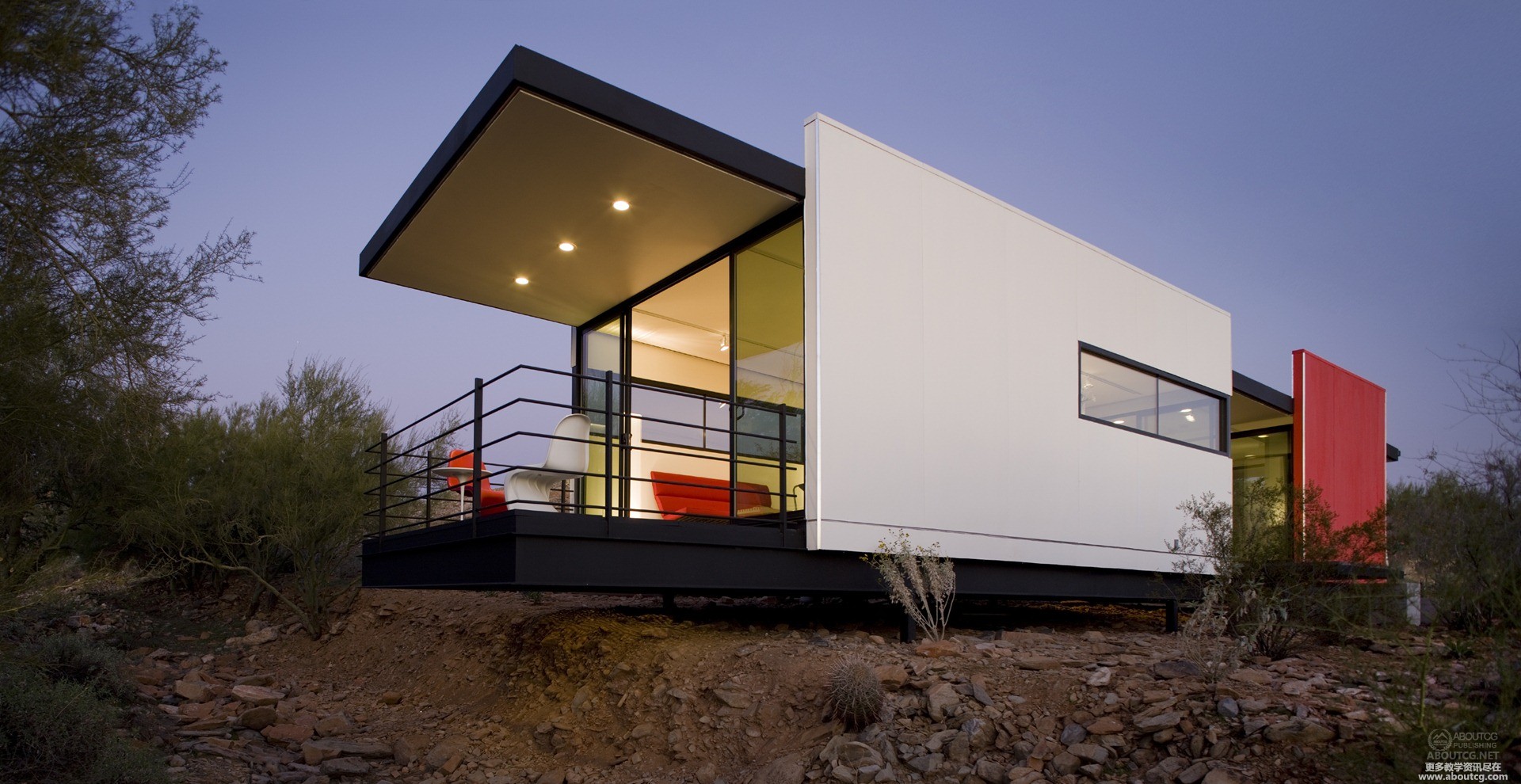
The Taliesin Mod.Fab is a model of sustainable architecture created by the prestigious Frank Lloyd Wright Foundation
(www.taliesin.edu) conducted by the architect Michael P Johnson.
要实现这个,视野的选择是至关重要的,但我在这里更感兴趣的是技术方面的实现。塔列辛预制建筑由建筑师Michael P Johnson创作,是弗兰克·劳埃德·赖特基金会所创造的可持续建筑的典范。
I loved working on an existing project and at the same time with the freedom to interpret it the way I wanted. I Did
not find any plans on the web and I mostly “eyeballed” it focusing a great deal on the environment, which I made up
for this project.
我喜欢在做项目的时候自由地用我自己的方式来完成它。做这个项目,我没有在网上找到任何的设计图,而我也更多地把精力放在了环境表现上。
o start, this project has a history. Never being full of the exciting Arizona desert location (see map), I started
looking at the side projects of great architects to express myself freely on a subject. So I searched on the side
of Frank Lloyd Wright on the Internet and found the Taliesin Mod.Fab. I loved it at first glance!
开始先说一下这个项目的历史。在激动人心的亚利桑那州沙漠地区(见地图),我开始寻找一个能自由表达自己主题的建筑。在网上搜索弗兰克·劳埃德·赖特的时候我发现了塔列辛预制建筑,并且对它一见钟情。
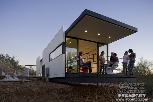
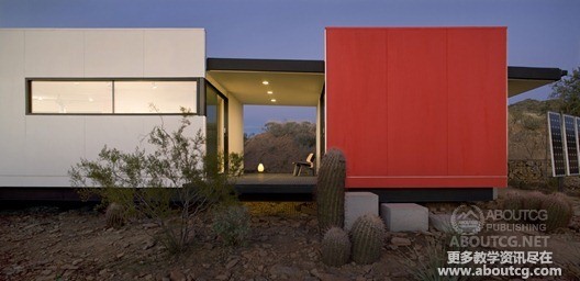
The photos were taken by – Bill Timmerman.
照片由Bill Timmerman拍摄
1. THE GROUND PLANE
1.地面
In order to highlight the architecture of the project, I chose to create an environment that has nothing to
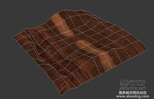
do with the existing (Arizona desert), so I immediately start working in the field. First step, a low-poly
terrain that gives the general form.
为了突出这个项目中的建筑,我选择创建一个与现实中(指亚利桑那沙漠)不同的环境,所以我立即开始了地面的工作。第一步,创建一个低面数的山体作为大致的环境。
2. THE GROUND TEXTURE
2.地面贴图
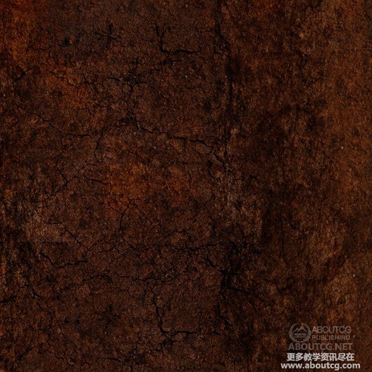
Second, is the beautiful piece of land the house will perch on, and unfolding of UV texturing in Photoshop.
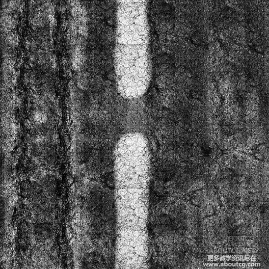
I started with the diffuse map, which is around 10k pixels. Then, I’ve created the bump maps, reflection,
and finally displace maps.
第二,房子会坐落在这片美丽的土地上。分好UV,在Photoshop中做贴图。我开始做了10K分辨率的漫反射贴图。然后做了凹凸贴图,反射,最后做了置换贴图。
Diffuse…
漫反射贴图
Displacement & Reflections
置换贴图和反射
In order to get maximum details for displacement, I’ve worked with 16-bit Tiff. In order to add details
and more randomness, I always add a little noise modifier after the displace.
为了让置换贴图能表现出最多的细节,我用了16位tiff格式。同时在置换贴图上增加了一些噪点来增加细节和随机性。
3. THE GROUND MATERIAL
3.地面材质
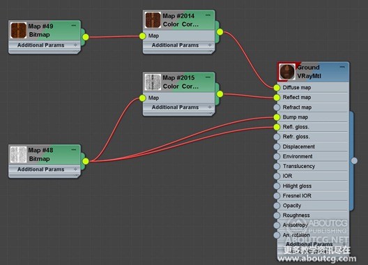
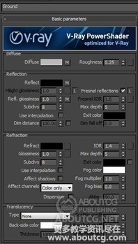
The shader is pretty simple, all work was done in Photoshop. The only little trick is to lower the IOR
(Index of Refraction) to 1.4 in order not to have a highly reflective floor. Basically the earth is not
light but with the ground (under the posts of the house) that can add some glossy reflections and give
the feeling of a mixture of material (soil and gravel)
材质非常简单,所有工作都是在Photoshop中完成。唯一的诀窍就是要把IOR(折射率)降到1.4来防止反射过高。土地基本上是不亮的(在房子下面),可以添加一些镜面反射来增加材质的混合感(土壤和砂砾)。
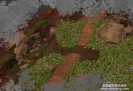
4. SCATTERING THE FOLIAGE
4.散布植被
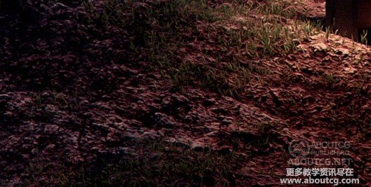
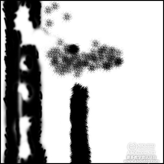
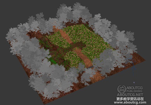
The foliage was scattered with the MultiScatter plugin, and this way I was able to multiply at random a
few models of plants. The placement was controlled with a texture mask that I painted in Photoshop.
For better, and added, control I also redraw areas with curves to include or exclude objects in them.
植被是用MultiScatter插件来放置的。用这种方法我可以随机复制几个植物模型。位置的控制是通过在Photoshop中绘制一张遮罩贴图来实现的。为了更好地控制植物散布的位置,我又绘制了曲线来标记是否散布植物的区域。
The MultiScatter Blend Mask…
MultiScatter插件的混合遮罩
The general scattering…
大体的植物散布
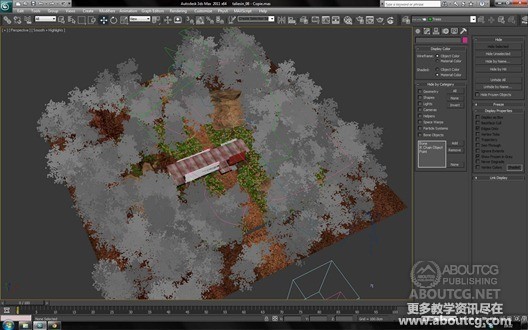
Here is the viewport with the various spline that control which type of plants goes where…
这张视图显示了各种样条线控制不同植物所放置的不同位置
5. THE ROCKS
5.岩石
For the rocks I used a free script – Rock Generator, to model a first base. I then applied a FFD
modifier to add variations and get to the shapes
I wanted. In order to place them accurately, I preferred to do place them “by hand” so that
each stone has at a specific place and in correlation to the site composition I was after.
我使用了一个免费脚本—Rock Generator来制作了一个基础的岩石模型。然后使用FFD修改器来得到我想要的形状。为了精确地放置,我喜欢手动放置他们,这样每块石头都有特定的位置,而又在后面的构图中彼此有联系。
1. MODELING
1.建模
The modeling part was quite simple, the architecture does not have any complex shapes, so
this is a polygonal modeling from flat surfaces or boxes. The only details added to the model
were chamfer edges to minimize the hardness of sharp angles.
建模部分是非常简单的,这个建筑没有任何复杂的形状,只要从平面或者盒子的基础上多边形建模就好了。唯一要增加的细节就是导一下边来防止模型过于尖锐。
2. INTERIOR
2.室内
The interior has been dressed with some models that I transferred from other scenes I have
(books, vases, etc.). Some models come directly from banks of professional design studios.
The models that were too low poly, were reworked to refine the details of the modeling. Some
objects are not visible in the final images, however I like to have a complete 3d model so any
view can be considered at any time… so it is worth the effort of making it all work all round.
室内是用我从其他现有场景中转过来的模型(书,花屏等等)来装扮的。有些模型是直接从专业设计工作室的模型库中导进来的。这些模型面数太低,于是重新修改了这些模型来增加一些细节。有些物体在最终的渲染图中是看不到的,但我还是喜欢做一个从任何角度都可以看的完整的3D模型。为这种全面的工作所做出的努力是非常值得的。
3. METAL PARTS
3.金属物件
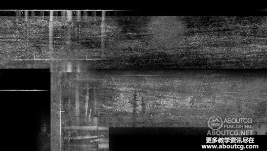
To add a lot of detail in modeling, UV unwrapping and maps are essential. For example for the
base metal, I unfold the UV and added some traces of dirt, dust etc. It is such details that give
richness to your compositions. We have to give a worn look, even slightly, to each object so
that it feels natural. Nothing is completely brand new and clean.
要增加模型的细节,UV的拆分和贴图是必不可少的。比如这个金属底座,我展开了UV并且增加了一些污垢、灰尘等等的痕迹。正是这些细节丰富了你的作品。我们要给场景增加一些破旧的样子,哪怕一点,也会让你的每个物体看起来更自然。没有东西是完全新的干净的。
Close-up on metal part…
金属部件的特写
Metal Reflection & Bump…
金属的反射和凹凸
The Metal Material Slate View…
金属材质的Slate视图
View of how the Metal Holes are Modeled…
金属孔洞的模型制作
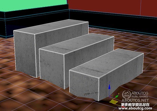
4. CONCRETE
4.混凝土
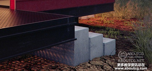
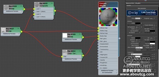
For the step, rough concrete, I used Arroway Textures. Again, to add details I combined diffuse
and reflection maps with a Composite Node. This makes details even more marked and consistend
with the bump map. This helps even more in cases there is no direct light falling on the surfaces.
这一步是粗糙的混凝土。我用了Arroway纹理。同样的,我结合了漫反射贴图和反射贴图来增加细节。凹凸贴图让细节更加显著。这在没有直接光照的表面上非常有用。
1. LIGHTING OVERVIEW
1,灯光概述
Lighting/Shading is by far the part I like best! I (always) start with a basic lighting using a HDRI
(made by Peter Guthrie). To balance quickly and effectively lighting, I start by putting an override
(VRayMtl Neutral Grey) on anything except windows. This allows me to quickly notice if the
lighting is consistent with the volumes of the project.
照明/色调是迄今为止我最喜欢的部分!我(总是)用一张HDRI(由Peter Guthrie制作)作为基础照明开始。为了让光照工作既快速又有效,我从在除窗户以外的任何物体上覆盖材质(VRayMtl中性灰色)开始。这样能让我很快发现光照在场景中是否合适。
2. INTERIOR LIGHTING
2.室内灯光
Once the general lighting is done, I started to choose my field of views and add interior lights.
大体的光照做好以后,我开始选择视角和增加室内灯光。
There are little spots on the floor. They were all modeled and textured with a VRayLightMtl
shader. I don’t want it to be a real part of the lighting job, so I keep it to 1. It’s here for reflection
and it helps me to do the glow job with a VRaySelfIllumination passes on post-production.
地上有一些小射灯。他们建模制作并赋予了Vray LightMtl材质。我不想把它们作为真实的光照,所以让它保持为1。这里它作为反射,并且帮助我在后期制作中配合VRaySelfIllumination作为光晕。
Finaly there are:
最终这里有:
§ HDRI
§ HDRI
§ VRayPlane in Skylight portal mode
§ 天光入口模式的VRayPlane
§ For spots, 34 very little VRayPlane (not visible in reflection and directional set to 0.5)
for more accurate shadows. Spots are a lot but with low values. This gives the feeling of a diffuse lighting.
§ 射灯用了34个非常小的VRayPlane(反射不可见并设定为0.5)以提供更加精确的投影。射灯很多但是值都很小,让照明感觉更分散一些。
§ 3 VRaySphereLight for model+model lights.
§ 3个VRaySphereLight作为模型+模型灯光。
3. LIGHT BALANCING
3.光平衡
To balance quickly and effectively lighting, I start by putting an override (VRayMtl Neutral Gray)
on anything but windows. This allows you to quickly notice if the lighting is consistent with the volumes
of the project.
Once this is done, I go often on the shaders and refined lighting.
为了让光照工作既快速又有效,我从在除窗户以外的任何物体上覆盖材质(VRayMtl中性灰色)开始。这样能让我很快发现光照在场景中是否合适。当完成了这些,我经常会调节材质和细调一下灯光。
4. RENDERING
4.渲染
I use the method “Universal Settings” to neutralize the grain. Simply put it is the antialiasing
that neutralizes the grain, but since V-Ray 2.0 this method shows its limits and explodes the
time rendered. It was my first scene with V-ray 2.0, I did not know it yet … ForGlobal Illumination,
a basic Irradiance Map / Light Cache
including the “Retrace Treshold” one of the new VRay 2.0 that eliminates the artifacts
generated by the parameter “Use Light Cache for glossy rays”. On top of that I always go
out a lot of layers to have a maximum of elements for post-production. Use pass is for me
an indispensable element for success to improve my reviews.
我使用“通用设置”来抗锯齿,但是自从V-Ray 2.0以来,这种方法显出了它的局限性以及爆炸式增长的渲染时间。这是我用V-ray 2.0做的第一个场景,这时候我还不知道……对于全局光照,一个基本的发光贴图/光照缓存中勾选“Retrace Treshold”, “Use Light Cache for glossy rays”是VRay 2.0中新加入的用以消除伪影的参数。另外我总是在后期制作中使用很多的层,让我可以有最多的元素。使用通道非常便于之后回顾我的整个制作过程。
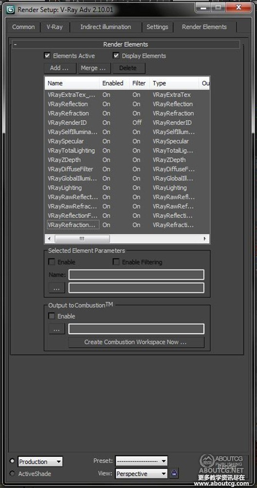
1. CHANNELS
1.通道
One advantage of Linear Workflow is to maintain maximum flexibility in post-production.
So even if a camera is on or underexposed, it will be possible to fix it in
Photoshop without losing quality. The first step is to set up the layers. Ambient Occlusion,
Reflection, Refraction, Z-Depth, etc..
线性工作流程的优势之一就是在后期制作中具有非常大的灵活性。所以即便有一个相机曝光不足,我也可以毫无质量损失地在Photoshop中修复它。第一步是设置图层。环境遮蔽,反射,折射,Z深度等等。
But all that doesn’t mean that you don’t want what an image which is well exposed in the
first place! When I’m not using DOF, I’m always using the “f/16 rule” It’s really simple
and can really helps to add stills without checking render again.
但是这并不意味着你不想让第一性渲出一张好图!当我不用景深的时候,我一般会用“f/16 rule”它真的非常简单,而且真的可以在不用重新渲染的情况下增加效果。
2. COMPOSITING
2.合成
The compositing is clearly the most important step of architectural image, this is where the
atmosphere is worked. In 3D, it is sometimes difficult to get certain effects, especially
because they “too expensive” (working time, rendering etc …) so it is best to have them in
Photoshop (or any other compositing software ). For example, rather than using the VRay
Fog to create a light mist in the background of the image, I use my Z-Depth pass. I begin with
the reverse, then put in overlay mode, then add a color saturation
(with clipping path) to the slightly blue tint. Guaranteed results! If I were to give advice,
it would be of learn to use all the layers one by one.
对于建筑可视化来说,合成无疑是最重要的一步,也是最出气氛的一步。在3D中,有时候很达到某种效果,特别是因为他们“太贵了”(工作时间,渲染等等……)所以最好是在Photoshop(或者其他的合成软件)中实现他们。比如,与其用VRay雾效来为画面的背景创造淡淡的雾气,我更喜欢用Z深度通道。开始先反向,然后使用叠加模式,接着添加一个略带蓝色的色彩饱和度(用剪切路径)。保证效果!如果让我提供意见,那就是一个一个地学习这些图层的用法。
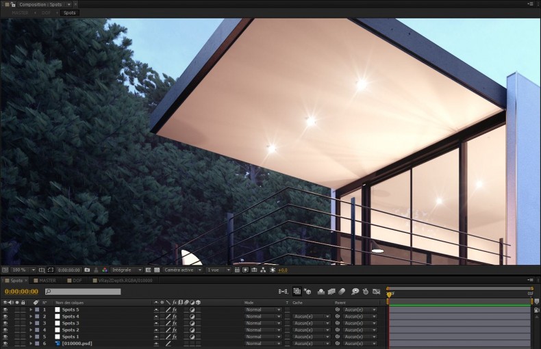
3. SPOTS IN AFTER EFFECTS
3.EA中的射灯
Once this is complete, I go on After Effects to add effects, especially depth of field,
chromatic aberration, and grain lens flare. Then I finish with some pretty basic color
corrections: Levels, Curves, Color Balance and Channel Mixer.
完成以后,我再去AE中增加一些效果,尤其是景深,色差和镜头光晕。然后我用了一些基本的校色命令:色阶、曲线、色彩平衡和通道混合。
4. FINAL RESULT
4.最终效果
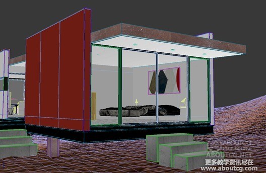
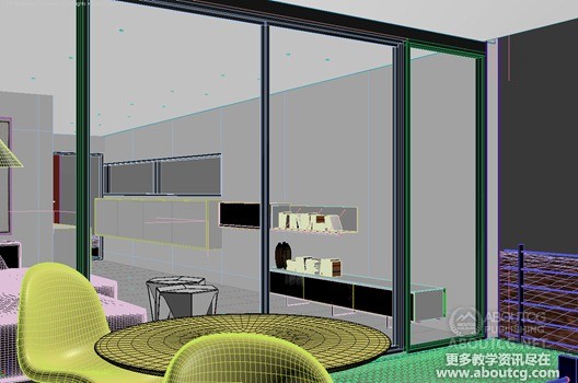
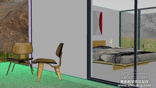
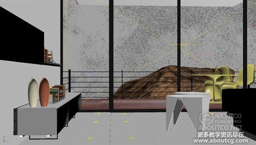
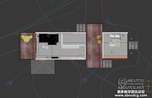
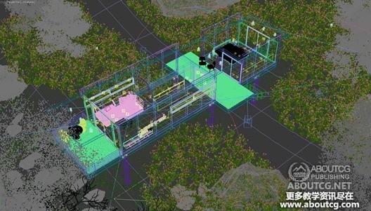
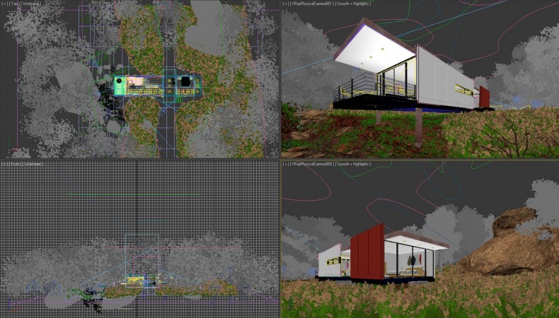
Just a quick look at how two POV’s look in the viewport…
快速来看一下两个不同视角。
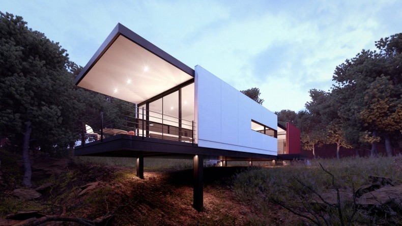
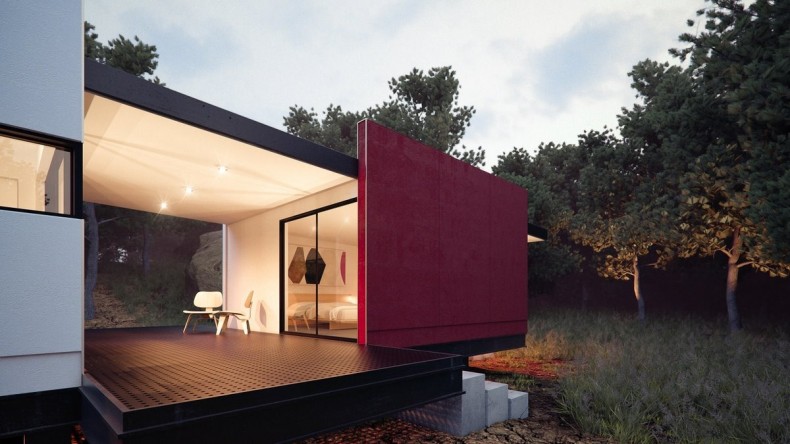
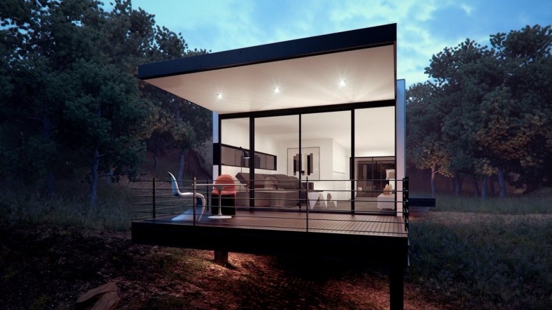
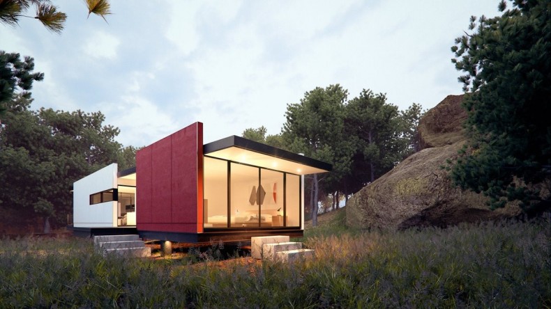
Here are the final images made in this set… (originaly at 6000px size, but reduced to 1200px to be friendly online).
下面是最终效果图(原始尺寸是6000px的,这里为了便于网络传输缩到了1200px)。
I hope you enjoyed this article, and that it helped you in some way. Please feel free to ask anything you like in the comment section below.
希望这边文章能够帮助到你们,如果有什么问题可以在下面留言讨论一下。
Cheers,
Matt.
注:本文在布光时,采用了类似Sunny 16 Rule的布光方法。 如果您想对这种布光方法有进一步的了解,欢迎查看这篇文章:
https://expertphotography.com/photography-101-sunny-16-rule/
文章中说明了如何在摄影中使用这种布光方法,和渲染有异曲同工的作用,谢谢。



















很久没看见这么好的文章了!