
A Slick Supernatural Text Effect
超自然文字效果
原文来自:http://psd.tutsplus.com/tutorials/text-effects-tutorials/a-slick-supernatural-text-effect/
作者: tutsplus
翻译: 雏田
有问题可以参与答疑
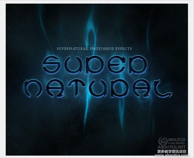
In this tutorial we’ll be creating a smoky night effect on text to give it an eerie supernatural sort of feel. It’s a good exercise in using the Wave distortion filter…
在本教程中,我们将创建一个文本黑烟晚效应,给它一个令人毛骨悚然的某种超自然的感觉。这是一个在使用波形失真滤波器很好的运动…
Step 1
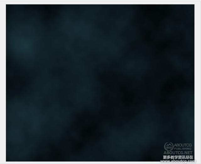
The first thing we need for our image is a background. We’re going to use a quick star-sky background. There are lots of tutorials around for this effect, and it’s actually a simple two-step process: clouds + noise.
So on a new blank canvas, start by choosing a dark blue color – #18323a – and black and then go to Filter > Render > Clouds.
第1步首先我们需要为我们的图片建一个背景。我们将使用快速明星的天空背景。周围有很多这种特效的教程,它实际上是一个简单的两个步骤:云+噪声。所以在一个新的空白画布,首先选择一个深蓝色的颜色- #18323a 和黑色,然后进入滤镜“>渲染”云。
Step 2
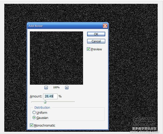
Now create a new layer, fill it with black, and go to Filter > Noise > Add Noise and use values roughly as shown below.
第2步现在创建一个新图层,填充黑色,然后转到滤镜>杂色>添加杂色然后大致如下所示使用了。
Step 3
Now that is way too much noise, so go to Image > Adjustment > Levels (or Ctrl+L) and bring those sliders together until you see most of the ‘stars’ vanish as shown.
第3步现在是太多的噪点,所以要以图像>调整>水平(或Ctrl + L)和一起把那些滑块,直到你看到的’星星’大部分消失,如图所示。
Step 4
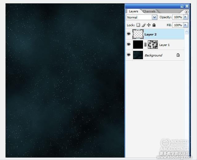
Now set the stars layer’s blending mode to Screen so that the black vanishes and just the stars remain. It’s still a bit too even though, so add a Layer Mask to the layer, and with a large fat brush just mask out blobs so that it seems a little less even. See the screenshot below to see the layer mask I added…
第4步现在设置的星星层的混合模式为滤色,使黑消失和星星依然存在。它虽然有一点,所以给这个层添加一个图层蒙板,并用一个大而肥的笔刷遮掉几笔以便星星看起来少一点。见下面的截图看我添加图层蒙版…
Step 5
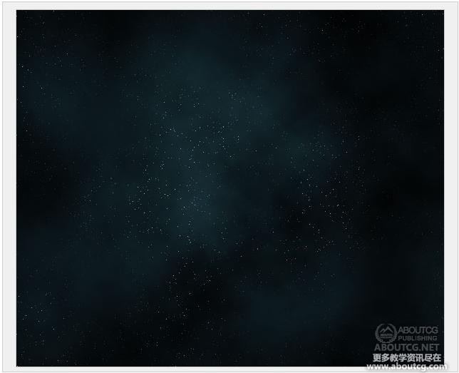
In this step, I added a radial gradient layer going from the white in the center to black at the edges and set the layer to Overlay and 45% Opacity. The effect is just to darken the edges and it’s not an essential step. In any case you should have something like this image shown below.
第5步在这一步,我添加了一个径向渐变层将会从中央白色到黑色边缘,并设置层覆盖,45%不透明度。这个效果只是为了变黑的边缘,这不是一个重要步骤。在任何情况下,你应该有如下所示的这个形象的东西。
Step 6
Now we add our text. I’ve used a font called Cuez_Ver6 which looks suitably strange. If you go to a free font site and look under sci-fi or the like, you’ll doubtless find something similar. Actually it’s quite unreadable really (especially the r), but who cares, it looks cool!
第6步现在我们添加我们的文字。我使用了所谓的Cuez_Ver6看似适当的奇怪字体。如果你到一个自由字体的网站,看到科幻小说或类似,无疑你会发现类似的情况。其实这是相当实在无法读取(特别是注册商标),但谁在乎,它看上去很酷!
Step 7
Next we’re going to add some layer styles. You can get a sample PSD file at the end of this tutorial, but because we’re switching to a pay system for the samples, I’ll go through the settings in case you don’t want to buy the file.
First I’ve given the text a Color Overlay of straight black (#000000). Then because the basis of this text effect is a creepy light, I added inner glows. First an Inner Glow as shown below, and then an Inner Shadow with color #54a4ff, blend mode Screen, distance 1, size 2, angle -90′, and everything else default.
第7步下一步我们将添加一些图层样式。你可以得到一个范例PSD文件在本教程结束,但因为我们切换到样本的薪酬制度,我将通过设置以免你不想购买该文件。首先,我已经给文本的黑色直(#000000颜色叠加)。然后,因为这个文本效果的基础是一种令人毛骨悚然的光,我加了内部发光。首先是内发光如下所示,然后用一个内阴影颜色#54a4ff,混合模式滤色,距离1,大小2,角度-90’,其余的都默认值。
Step 8
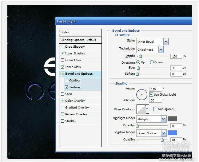
Next we use a textured Bevel and Emboss to give the style some unevenness. You can see the Bevel settings below. The Texture I added is just one of the standard ones that comes with Photoshop that looks like bubbles. And I set the Depth to -79.
As you can see below, this makes the inner glow look a lot more uneven.
第8步接下来,我们使用一个纹理的斜面和浮雕样式给一些不平坦。你可以看到下面的斜面设置。纹理我只是增加了一个标准的用Photoshop看起来像泡沫来。我设置深度为-79。正如你可以看到以下,这使得内发光看到了很多的不均衡。
Step 9
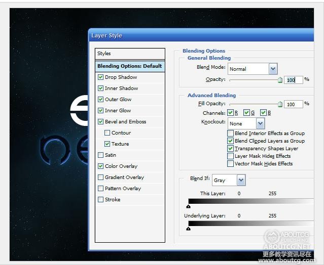
Finally I added a Drop Shadow and Outer Glow, both set using Screen and the color #008ac5. I used both so that I could make one of them a small glow and one a really spread out glow, so the distances were 10px and 100px.
第9步最后,我添加了一个阴影和外发光,都设置使用屏幕和颜色#008ac5。我使用这样我就可以让其中一人是小辉光和一个真正分散发光,所以距离是10px和100px。
Step 10
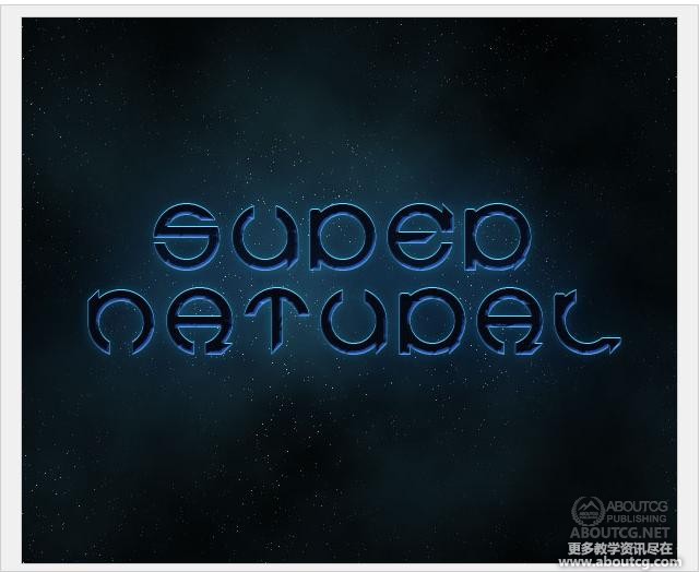
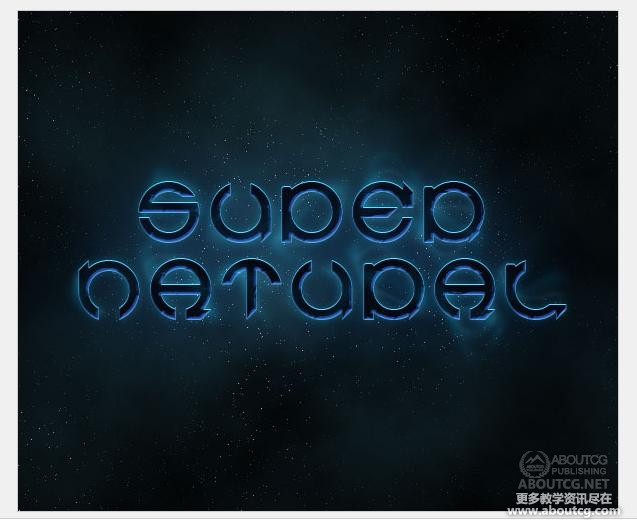
Ok, so here’s our text with the Layer Style applied. It’s off to a good start, but you can only do so much with Layer Styles, so now we do some good ol’ manual effects.
第10步好了,这里是我们的图层样式文字应用。这是一个良好的开端,但是你只能这样做的图层样式多,所以现在我们做些好事醇’手册的影响。
Step 11
First of all, duplicate the text, right-click the layer, and remove the layer styles. Then change the color of the text to a fluorescent blue (#5cdbff). Then press the up arrow once to move it one pixel up. This will give a sort of glow effect as shown below.
第11步首先,复制文本,右键单击该层,并删除图层样式。然后更改文本的颜色为蓝色荧光(#5cdbff)。然后按向上箭头一次移动一个像素了。这将使一个发光效果的排序如下。】
Step 12
Ok, this next step is the key step in this tutorial.
Duplicate the text layer with the fluoro blue color. Then go to Filter > Distort > Wave. You can use mostly the default settings, except where it has Scale. I’ve set this to just 10% and 10%. This will distort the text, but only a little bit. If you leave it at 100% the effect is pretty full-on!
(Note: In the image below, I moved the text down so that it would be clear that I was applying the wave filter to it.)
第12步没关系,这下一个步骤是在本教程的关键一步。重复氟蓝色文本层。然后进入滤镜>扭曲>波浪。您可以使用大部分的默认设置,除非有缩放。我已经设置为只有10%和10%。这将扭曲文本,但只有一点点。如果你设置100%的那效果是非常完美的!(注:在下面的图片,我移动这个文本,以便将它很清楚,我是给它应用波浪滤镜。)
Step 13
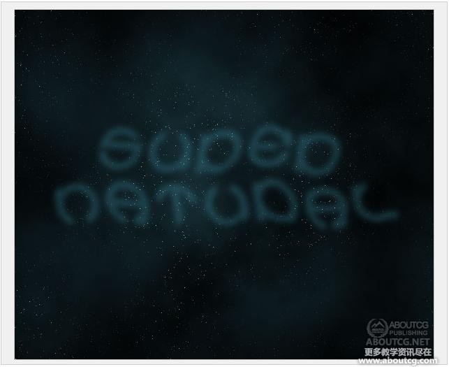
After you have distorted text, go to Filter > Blur > Gaussian Blur and use a value of 4px. Then set the Opacity to 20%.
In the screenshot below, I’ve switched off the main text so that you can see the distorted text.
步骤13当你扭曲文本,请转到滤镜>模糊>高斯模糊和使用的4px值。然后设置不透明度为20%。在下面的截图,我已经关掉的主要内容,以便您可以看到扭曲的文本。
Step 14
Now hold down Ctrl and click on that text layer to select it’s pixels and then go to Select > Modify > Contract and use a value of 5px. Then press Shift+Ctrl+I to invert the selection and hit Delete. This should leave a thin wispy looking remnant of your text.
Now switch on the main text layer, and it should look like a tiny bit of smoke coming off the letters.
步骤14现在按住Ctrl键,并在此文字层单击以选中它的像素,然后去选择>修改>合同并使用5px值。然后按SHIFT + CTRL +I反选和点击删除。这可让薄束状看你的文字的残余。现在切换主文本层,它应该看起来像一个微小的烟雾脱落的信位。
Step 15
Now duplicate that layer and go to Filter > Distort > Wave and distort this copy even more.
Now repeat this step a couple of times and vary what you do with the wave. So you might want to press Randomize sometimes, or sometimes distort the copy a few times. Also I used a mix of blending modes on the different copies of the smoke. Two of them I had no blending mode set, two of them I used Overlay, and for another two I used Hard Light.
Also it’s a good idea to mix up whether they are behind or in front of the text. Remember you want the effect to look like wisps of smoke coming off the letters.
第15步现在,复制该层,进入滤镜>扭曲>波浪和歪曲这个副本甚至更多。现在,重复此步骤两三次,你做的波浪会有很大出入。所以,你有时可能希望新闻界的Randomize,有时歪曲复制几次。此外,我使用了混合对烟尘的不同组合模式的副本。其中两个我没有混合模式设置,其中两个我用覆盖,以及另外两个我用强光。另外这是一个好主意,混淆他们是否在后面或前面的文本。请记住您想要的效果看起来像烟雾脱落字母缕缕。
Step 16
Now that we have our small smoke sorted out, it’s time to add some bigger wisps.
So again duplicate the fluoro blue text layer.
步骤16现在,我们有我们的小烟整理,是时候添加一些更大的缕缕。所以,再一次重复氟蓝色文字层。
Step 17
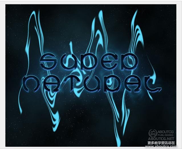
We now apply another Wave distortion, but this time where it has Scale, set the horizontal to 5% and the vertical to 100%. This will make the shapes become very elongated as shown. Once you’ve applied the wave, just repeatedly hit Ctrl+F to keep doing it over and over again until the text has been completely distorted into long wispy shapes.
步骤17我们现在用另一波形扭曲,但是这一次有缩放的地方,设置水平为5%,垂直为100%。这将使形状变得十分细长,如图所示。当您应用了波浪,只是再三按Ctrl + F将继续做下去,直到反复再次文本已完全扭曲成长而稀疏的形状。
Step 18
Once you have a good smoky-looking effect, set the layer blending mode to Hard Light and you should have something similar to the image shown below.
第18步一旦你有一个很好的烟尘效果,设置图层混合模式强光,你应该有类似于如下所示的图像。
Step 19
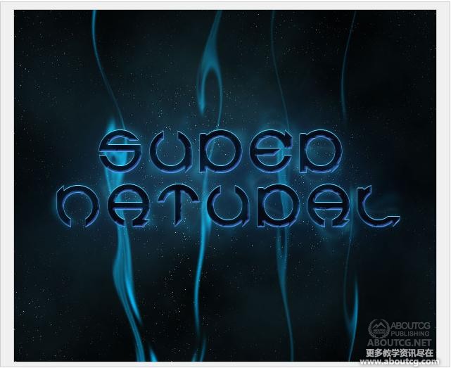
Now duplicate that last layer and run a Gaussian Blur by going to Filter > Render > Gaussian Blur with a value of 4px. This will make our layer look a little softer.
After that, get a large soft eraser brush and just brush away some of the bits at the bottom and top so that it fades off as it approaches the edges.
You may also want to repeat these last couple of steps to add more wisps.
步骤19现在,重复,最后那层和运行滤镜>模糊>高斯模糊4px。这将使我们的层看起来有点软。在此之后,获得较多的软橡皮刷,只是刷底部和顶部的一些位置,使其看起来像褪色的感觉。您可能还需要重复这些步骤,最后重复添加使其有更多的缕缕。
Step 20
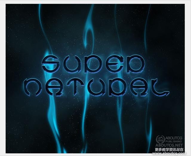
Here I’ve removed the bottom of those wisps and added a few more subtle copies. Also I added some extra type above the main text just to make it look a bit cooler.
步骤20在这里,我已删除了这些缕缕底部,增加了一些微妙的副本。此外,我上面加了一些额外的类型在主要文本上只是为了使它看起来更酷。
Step 22
Finally, to give it a more eerie feel I added a layer above all the others and with a large brush painted some green on top, then set the layer blending mode to Color to make it so that the image is a blue-green coloring. And we’re done! One slick, smoky effect!
步骤22最后,为了给它一个更怪诞的感觉,我添加了上述所有的人,用大笔刷刷一些绿顶,然后设置图层混合模式为颜色,以便使该图像是一个蓝绿色的色彩。我们就大功告成了!一个光滑,烟特效!















0回复photoshop 超自然文字效果制作"