
‘Creating Next-Gen Environment Textures using Total Textures’
使用Total Textures创建次时代环境贴图
by Daniel Vijoi, Lead Texture Artist – AMC Studio
原文来自:http://www.3dtotal.com/tutorials/nextgen_environment/
作者: Daniel Vijoi
翻译: AboutCG 会员
有问题可以参与答疑
Programs Used: 使用软件:
Maya & Photoshop
Introduction: 介绍:
Hello, my name is Daniel Vijoi and I have been working in the gaming industry for 7 years. My current job is Lead Texture Artist at AMC Studio, a Romanian game development company based in Bucharest. During this time I have worked on many projects, like Test Drive Unlimited (Atari), Mercenaries 2, Saboteur (Pandemic Studios/EA), Pure (Blackrock Studios/DISNEY), Rise of Nations & Rise of Legends (Big Huge Games/THQ), and other exciting titles yet to be announced.
大家好,我叫Daniel Vijoi,我在游戏业已经工作7年了。现在我在AMC Studio担任首席纹理贴图艺术家。是一家在罗马利亚首都布加勒斯特的游戏公司,在此期间,我参与过很多的项目。如Test Drive Unlimited (Atari), Mercenaries 2, Saboteur (Pandemic Studios/EA), Pure (Blackrock Studios/DISNEY), Rise of Nations & Rise of Legends (Big Huge Games/THQ),以及其他的已经发布过的游戏。
I decided to write this tutorial as I noticed a certain lack of interest for game-related environmental texturing in the 3D community. This tutorial is targeted at medium level users and will present the process of texturing a photorealistic building that has already been modelled. I will focus on the texturing process in particular, even though the modelling and UVs are also important for the final look of the building.
我决定写这个教学是因为我发现在3D社区里比较缺乏游戏环境纹理的资料。这个教学是为中级用户制作的,教学将向大家展示为创建好的模型制作真实纹理的过程,虽然模型的制作和UV得编辑也很重要,但我将重点介绍纹理制作部分。
Getting Started:开始: ________________________________________
For this tutorial, I used the 3DTotal Texture DVDs, a large libra ry of diverse textures that we here at AMC Studio use regularly. At the end you will find a list of all the specific 3D Total Textures I have used for each texture that I have created. Some of the images included in this tutorial also mention which textures were used.
在这个教学里我使用了3DTotal Texture DVDs里面的纹理,这是一套现在AMC Studio也在使用的种类丰富的纹理库。在本教学的最后你会发现使用了3D Total Textures里的纹理列表,一些在本教学重包含的纹理也会提到哪些部分被使用到了。
Usually, it is preferable that one artist does the entire process of modelling and texturing, as usually these processes are interlinked, so optimising the geometry will make changes to the texturing, and vice-versa. This is why I will also mention some of the means by which the geometry and UV have to be optimised to keep the textures needed to a minimum, whilst also adding extra details and personality to the asset.
通常,一个艺术家完成整个建模和贴图制作过程会比较好,因为通常在整个流程中建模和纹理制作是相互关联的,在优化模型的时候会影响到贴图,反过来也一样。这也是为什么我也会提到一些模型和UV必须优化以使得纹理最小化,同时也添加额外的细节和个性。
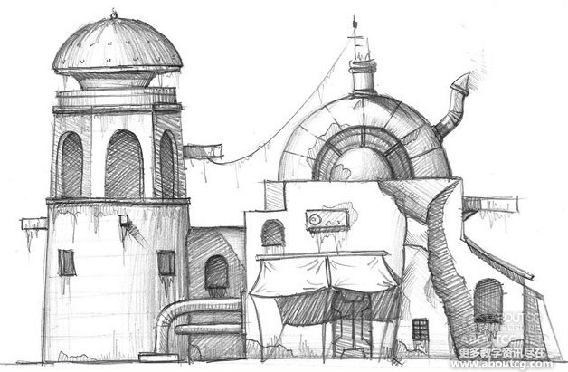
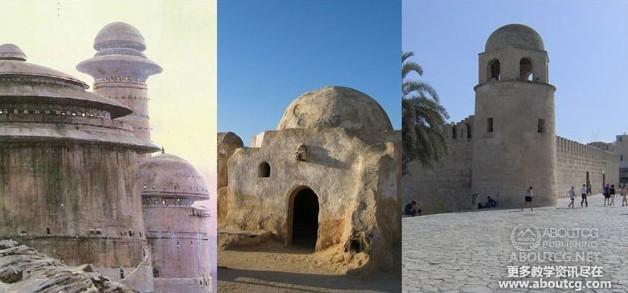
The majority of game assets start their life as a concept art and some reference images that will help to better define the character of the building. For this tutorial I used the following concept art and reference photos (Fig.01 – 02). The subject of the concept is a desert building, inspired by the settlements on Tatooine and typical real-life Tunisian buildings. I also included some extra sci-fi details to make it more interesting. The desert environment will influence the chromatic variation of the textures as well as their detail, as far as weather influence on materials goes. Being a multi-purposed building, details vary; there is a generator in the tower and the back side of the building can be used as a market stall to sell different things.
游戏项目首先是从一些概念设计和参考图片开始的,这些可以帮我们更好的定义建筑的特征。在这个教学里我使用了下面所示的概念设计和参考图片 (Fig.01 – 02).这张概念设计的主题是一幢沙漠里的建筑,灵感主要来自于塔图因的居民建筑和典型的突尼斯建筑。我也添加了一些科幻的元素来让他们看起来更有趣些,只要气候影响到了材质的变化,沙漠的环境会影响到纹理颜色的变化,其细节也一样。为了表现出多功能的建筑和细节变化:在塔里面设计有发电机,在建筑的后面设计一个出售各种东西的杂货铺。
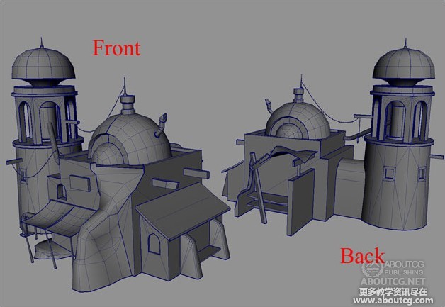
With the help of the concept and reference pictures, I modelled the low polygon geometry. The model has 2500 polygons, well under the 2700 polygon budget set initially. This will allow me to add further cuts in the geometry to optimise texture usage later on in the process. Here’s a screenshot of the building geometry from two different angles (Fig.03).
在感念图很参考图片的帮助下,我创建出了低模,这个模型有2500个面,低于原来预期的的2700个面。这样我可以再项目的后期在优化纹理时添加更多的线。下面是从两个不同角度观看的屏幕截图。
Here you can see the same geometry with the UVs unwrapped (Fig.04). The checker texture was added to make sure all the UV shells are proportional and that there are no areas with deformed UVs.
这里你可以看到前面创建的模型分好UV的样子(Fig.04)。棋盘格纹理是为了保证UV面片的扭曲在合理的范围内。
Before texturing, a quick drawn texture layout would be in order (Fig.05). This can be done either in Photoshop or on paper. This makes the texturing a lot easier if the layout part is sorted out beforehand. Because this process is rather quick, I usually sketch a couple of versions before I decide which the best one to use is. First of all, the entire geometry has to be measured properly so that the UV layout is as compact as possible, with as little unused space as possible. Large areas on the geometry will take up more space on the UVs than small areas. In this case, I chose the keep the texture resolution at 128 pixels per metre. This will allow me to keep all the UVs in proportion with each other and also figure out how much space every detail on the building will take on the texture. Having all the parts at the same resolution will ensure that no area of the building will appear to be blurrier than another.
在贴图制作前,一张快速绘制的纹理布局是很有必要的(Fig.05),你可以在Photoshop里完成或者手绘完成,如果预先就把纹理的布局分好类,那么会使得纹理的制作更加简单。因为这个过程很快,我通常会在确定最后的纹理布局之前绘制几张的不同的布局来供我选择。首先,整个UV面片需要仔细的布局以保证UV空间的尽量使用。尽量减少空白空间的面积。模型上的较大区域在UV空间中也要适当的占据较大的空间。在这种情况下,我选择了在每米使用128像素分辨率的纹理。这将允许我保持各面片的相互比例,并计算出每一个细节的纹理需要多少空间。让所有的贴图都保持同样的分辨率会确保没有贴图会比其他部分的贴图显得更模糊些。
Because this is a photorealistic building, the textures have to be chosen carefully so that they do not contain any artefacts due to compression. The artist has to closely follow the colour provided in the concept art or, as is the case here, the reference photos if the concept art is not collared. This particular building is part of a desert environment, so the tone of the textures has to match the desert climate.
因为这是一个写实的建筑,所需要的纹理都必须仔细的选择,确保没有压缩的痕迹。艺术家必须密切注视该概念艺术所提供的颜色,或者如这里的情况,就是参考照片所提供的颜色,应为概念设计没有提供颜色。这个特殊的建筑是沙漠环境的一部分,所以纹理的色调要匹配沙漠的气候。
When choosing the base textures, the most important things to follow are the material details, as the colours can always be modified later. Another good idea would be to choose textures that have a lot of colour variation, as this colour variation will add a lot of personality to the building.
但选择基础纹理时,最需要关注的是材质的细节,因为颜色在后面可以随时更改。另外一个好的方法就是对选择的纹理调色,因为调过色的纹理将会为建筑添加更多的个性。
Here’s how the wall texture for the basic shape of the building was made (Fig.06). The top image is the original texture while the lower one is the result after tweaking the colours with Colour Adjustment and a bit of Unsharp Mask.
下面这张图片就是用来作为建筑基础纹理的贴图(Fig.06)。顶上的是原始纹理,下面的是经过颜色调整和锐化后的图片。
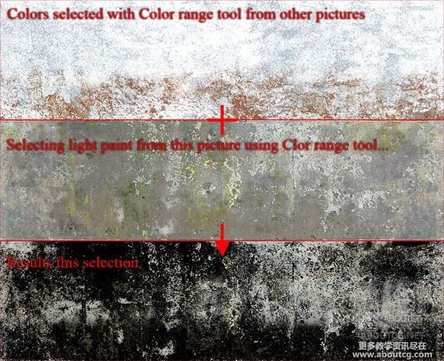
The next image shows how I added different colour tones and a layer of paint to the existing wall (Fig.07). The easiest way is to select the necessary details with Colour Range and add them to our PSD. I use this method a lot.
下面的图片显示了我是这么添加不同的颜色色调的,以及新建在已存在的墙壁纹理上的一层(Fig.07),最简单的方法是使用色彩范围选择工具从其他纹理选择需要的细节然后添加我们PSD文件里。我常常使用这种方法。
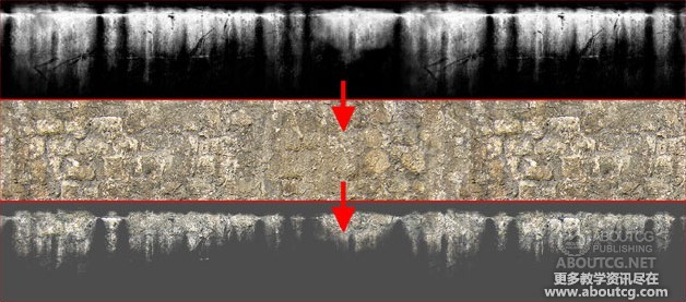
Next up I used a mask (top frame) to add some details from a texture (middle frame) to our map. The result can be seen in the lower frame (Fig.08). The blending mode for that layer will be Normal. This will ensure that the newly created layer will not modify the original texture’s colour.
下一步我使用了一张蒙板(最上面一张)来为我们的贴图添加一些细节(中间的一张)。结果在最下面一张(Fig.08).这一层的混合模式是正常模式。这样会确保新创建的层不会影响到原始纹理的颜色。
Most of the details can be added in this manner by using masks or Colour Range to isolate desirable details from one texture and add them to our own. The final colour can always be modified using Replace Colour if needed.
大部分的细节都可以使用这种方法来添加:使用蒙板或者色彩范围选择工具来选出自己需要的细节,然后添加到自己的贴图上,如果需要,最终的颜色可以使颜色替换工具修改掉。
One very important thing to take into consideration is the texture resolution. The artist must always be careful when scaling the source textures to keep both the natural scale of the details while at the same time ensuring that particular details will not be sharper or blurrier than the rest of the texture.
有一件需要考虑的比较重要的事就是纹理的精度。艺术家在缩放原始纹理的时候一定要格外小心,既要保证自然的缩放又要确保纹理上的细节不要因为缩放而变得模糊起来。
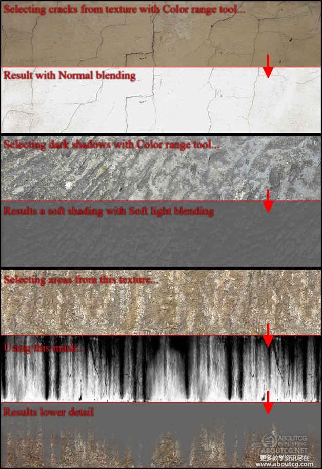
Another thing to consider is the management of the PSD files. This will help obtain the maximum texture quality but also decrease execution time when working on a tight schedule. All layers should be named and organised in groups to make sure all the details are easy to find in case they are needed. I try to keep the layers on Normal as much as possible to make sure I keep as much detail from the original texture while avoiding colour deviation and artefacts caused by using other blending modes like Hard Light or Overlay. If these blending modes are necessary, it is very important to keep the resulting texture as photorealistic as possible. Soft light seems to be a blending mode suitable for accentuating highlights, shadows, bevels, etc.
另一件需要考虑的事情就是PSD文件的组织。这将帮助我们获得最高质量的纹理以及提高工作效率,尤其是在时间紧凑的情况下。所有的图层都需要命名,并且分组放好,这样可以保证所有的细节都可以在需要的时候快速的找到。我试着尽量让图层都是正常的混合模式,以确保从原始纹理贴图获得的细节没有颜色的丢失和人工痕迹,比如使用了Hard Light or Overlay.的图层混合模式。如果这些混合模式是必须的,那么他对尽量保持最终贴图效果的真实性有很大的作用,Soft light这种混合模式看起来是一种比较适合用来混合高光、阴影、斜面等等
Here is one example that follows the above mentioned (Fig.09).
下面是一张遵从上面提到的方法的例子(Fig.09).
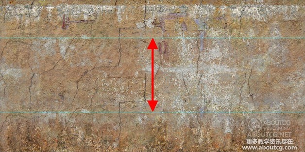
This next picture shows the final wall texture with a bit of saturation added to it (Fig.10).
下面这张图片是稍微加了点饱和度的最终墙壁贴图。(Fig.10).
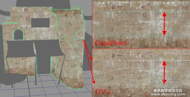
The two Photoshop guidelines mark the lines that define how the texture is tiled. I needed to make the texture tileable on these lines as the wall is 5.5 metres tall, but I only had 4 metres’ worth of texture to work with. The result is that I had to cut the geometry at 3 metres in height and tile the image at that height to increase the usable surface area. This technique is very useful when texturing a high building, but you also need to have dripping details at the top and dirt like details at and bottom of the texture. So basically, the middle part (between the guidelines) can be tiled to cover as much space on the geometry as needed, whilst keeping the top and bottom unique.
两条Photoshop的指示线标示了贴图时如何平铺的。我需要纹理平铺在这些5.5米高的墙上,但我只有4米’贴图可以使用。结果是,我不得不在3米处的高度剪切掉几何体然后平铺纹理,以增加可用面积。这项技术在编辑很高的建筑纹理时是非常有用的,但也需要在顶部和底部的纹理添加污垢等细节。所以基本上,中间部分(在指示线之间)可以平铺覆盖于需要的地方,同时又保持模型顶部和底部独特。
Here is the same texture applied to the geometry (Fig.11).
这是赋予模型的同一张贴图(Fig.11).
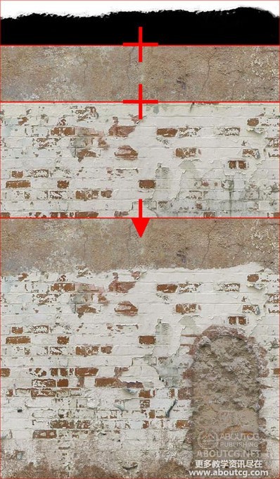
With this texture, not only does it tile with itself, but also with another texture used for the back of the building. This second texture has been created by using this one as a base and adding some masked details to make it unique (Fig.12).
这张贴图不仅仅是用在自身的平铺,也用于建筑的后部所需要的纹理制作。第2张是使用上面的同一张纹理并且添加了一些通过蒙板提取的细节来使其独特的贴图(Fig.12).
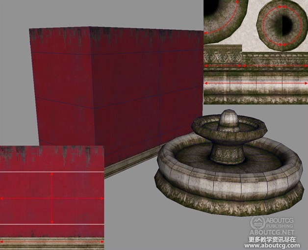
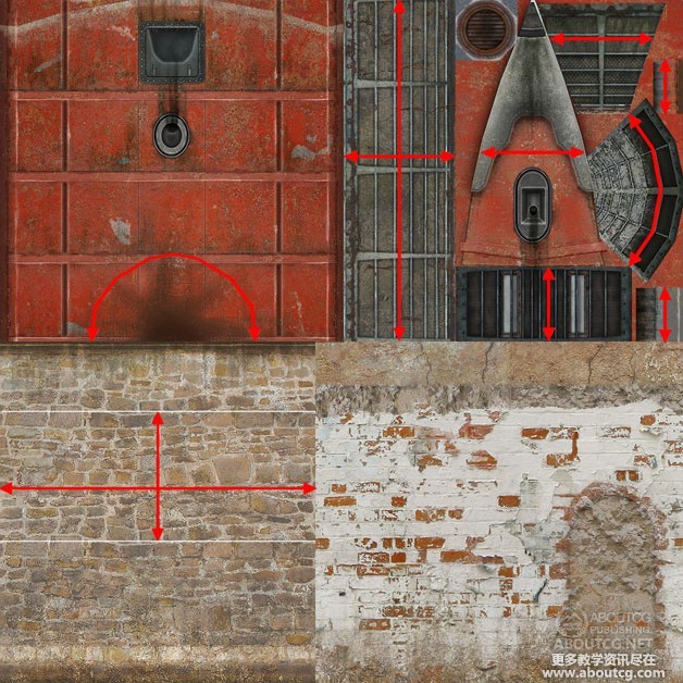
Here are some further tiled texture examples, this time from assets that are not related to this one (Fig.13 – 14).
这里有更多的纹理平铺的例子,但这些并不是本次教学的例子的东西(Fig.13 – 14).
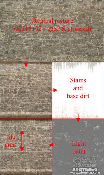
The same method has been applied when doing the tower wall seen (Fig.14). To make the tile harder to spot, I reduced the detail of the texture by making the bricks look more alike in colour and intensity. Using some masks from the previous texture, I have saved some time when adding dirt at the base of the tower and dripping details at the top. Afterwards, I have used Colour Range to select some painted areas from the base wall texture and add them on top of the tower wall texture for added variation. It is often a good idea to use common or similar details for all the textures of the same asset to add unity to the texture and make them fit together better.
在制作塔德墙壁的纹理时也使用了同样的方法(Fig.14).为了使平铺不易被观察到,我通过使砖的颜色和强度看起来比较一致来减少纹理的细节。使用前面用到的一些蒙板,在制作塔的底部和顶部的脏的细节时节省了不少时间。接下来我使用色彩范围选择工具选择了一些细节再放置在塔德纹理的顶部来增加变化。通常再所有的贴图的细节制作上使用相同或者相近的纹理细节素材是个不错的主义,这样可以使他们看起来比较统一。
After adding these details, I copied a row of stones from the top part of the tileable area and blended it in with the lower part. This will make the texture blend in seamlessly. Usually, making the textures tileable should be kept for last to save time. Also note that the texture tiles vertically to span the height of the tower, but also tiles horizontally to make it easier to map it on the circumference of it (Fig.15).
添加完这些细节后,我把顶部一排的石头复制粘贴到底部,并且使其融合,这样可以让贴图变得无缝。通常使用纹理平铺会节省很多时间。同时要注意纹理在垂直和水平方向的平铺使得纹理合适的包裹出塔的上下和周围。(Fig.15).
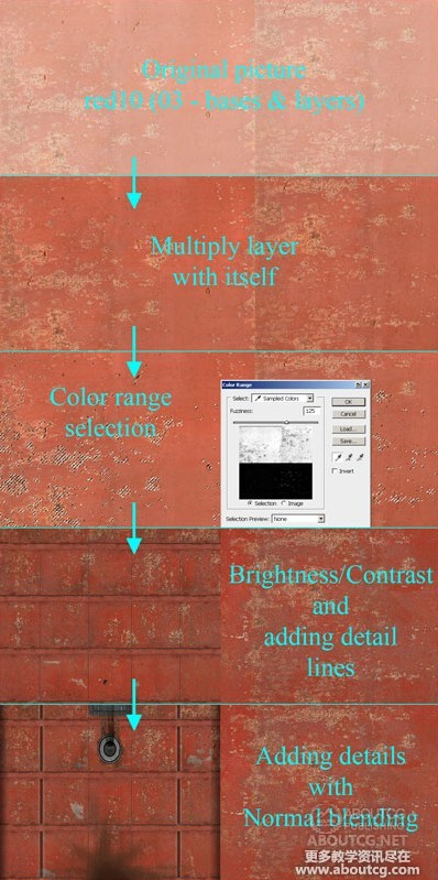
The above image contains a step by step description of the way the roof texture was created. First I added contrast and colour to the texture by duplicating the layer and setting the blending mode to Multiply. I then used Colour Range to select some of the red paint and increase its intensity. Finally, I added some rust, paint chips and metallic details to make the texture stand out.
上面的图片详细的描述了顶部贴图的制作步骤。首先复制图层把图层的混合模式改为Multiply来增加对比度和色彩饱和度,然后使用色彩范围选择工具选择红色的油漆并增加起强度,最后添加一些锈迹、漆片和金属细节来完成这张贴图。
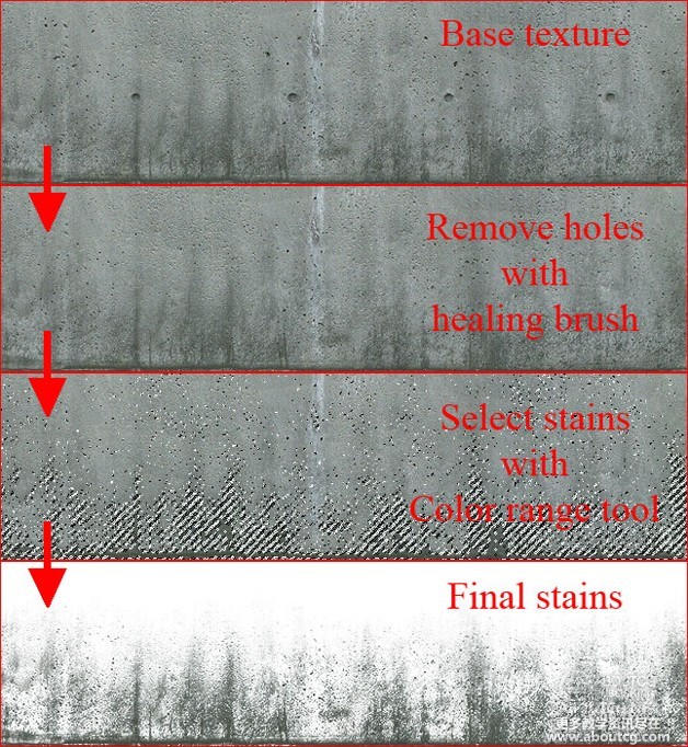
Next up is how I extracted the dripping details form a concrete texture to be used for the roof as well as other elements of the building (Fig.16).
下一步是我怎么在水泥墙的纹理上提取细节的方法,这张水泥贴图将会被用于强顶以及该建筑的其他的部分的贴图制作(Fig.16).
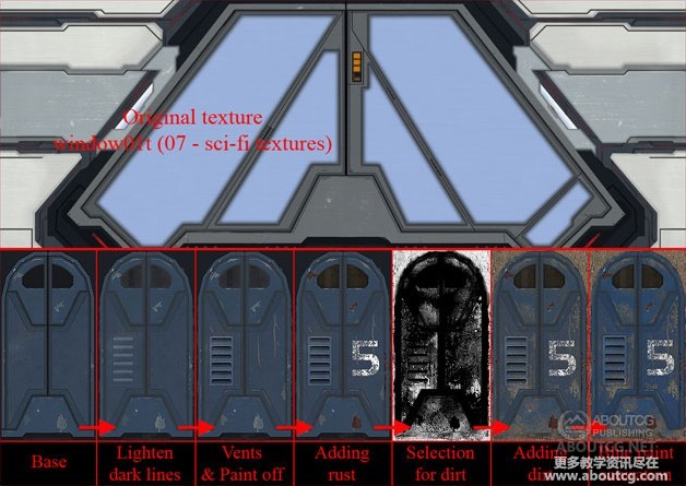
Now, moving on to some of the details, we’ll first take a look at the entrance door (Fig.17). It is important to remember that keeping the PSD files organised and with as few layers and special blending modes as possible will avoid making the final texture look too cluttered. One layer for each detail type should be enough: rust, chipped paint, scratches, dirt, text, etc. A good idea would be to keep volumetric details as separate layers to make them easier to convert to a normal map later on.
现在,继续添加细节,我们将转到入门大门的贴图制作(Fig.17).重要的是一定要记得保持PSD文件的合理组织,以及部分图层的特殊混合模式,避免最终贴图文件太过于杂乱。每一种类的细节一个图层就够了:锈迹、漆片、划痕、污垢、文字等等,这这些都分层制作会在后面转换成法线贴图时比较容易。
The following image shows how the wood texture was created. When details with clearly defined vertical or horizontal lines are concerned, the first thing to do is make sure they are lined up properly. This will make the tiling process easier (Fig.18).
下面的图片显示木头贴图纹理是如何创建的。清晰的水平或者垂直线定义的细节需要认真对待,首先要做的是就是确保他们适当的排列,这样将会使得平铺的过程更简单(Fig.18).
Optimising the workflow means that it would be a good idea to keep some textures or elements of the textures in a “library” organised by category – dirt, stains, rust, etc. This will make them easier to find when needed. At the same time, the most interesting elements of the already created textures can be used either for the same asset or for other assets to save time if necessary.
确保纹理或者细节元素按照类似于图书馆的分类组织是很有必要的,灰尘、污垢、锈迹、等等。这样在需要他们的时候将会很容易找到。同时,在需要的时候在可以最短时间内把已经创建好的最有趣的元素使用到其他项目当中去。
One last detailed area I’d like to point out is the pipes. Here is the creation process detailed (Fig.19).
最后我想指出的细节区域是管子的位置,下面是创建的详细过程(Fig.19).
To summarise, only a few Photoshop tools are used when creating textures – tools like Colour Range, Replace Colour or Healing Brush. It is important to keep the number of layers to a minimum and use blending modes as little as possible. Always keep the resolution consistent throughout the textures. Don’t forget to keep volumetric details as separate layers to make it easier to create the normal map and specular map later. All the time saved from keeping the workflow as organised as possible will give you more time to fine-tune the texture or add details to areas that you might have neglected.
总结一下,在使用Photoshop的时候只使用了很少的几个工具人如:颜色范围,替换颜色或者防止图章工具。尽量确保最少的图层使用了混合模式是很重要的,在纹理绘制的过程中要始终保持精度,不要忘了把有体积的细节分层制作,这样在后面创建法线贴图和高光贴图的时候会比较简单。尽量一直确保整过流程的条理清晰。这样将会使你可以反复的调整纹理或者添加忽略掉的细节。
Fig.20 shows the final version of the first map, with all the tiling areas. I set my target at using two 1024×1024 textures and one 512×256 alpha texture. Even with the budget restrictions, this should never be an impediment in adding as much details as possible. Adding more details on the tileable textures is always better than adding less when trying to minimise visible tiling areas.
Fig.20显示了第一张颜色贴图的最终结果,以及所有需要平铺的区域。我把纹理设置成两张1024*1024大小的纹理以及一张512*256大小的alpha贴图。确保在预算限制之内,这将在尽可能添加细节的时候不会成为障碍,当想尽量减少可见的平铺区域时,在无缝贴图上添加更多的细节总是比添加较少要好,
This is the second diffuse texture, with the tiling areas also marked out (Fig.21).
这是第3张颜色贴图,并且把需要平铺的区域标示出来了(Fig.21).
The next major step to be taken is creating the normal map. First thing to do is create a height map from the diffuse map we already created. This is by no means realised by just de-saturating the colour texture and running a filter; there is more to it than that. A close study of the volumes defined by the colour texture is necessary. We start by isolating large volumes like door frames, window frames and large grills. Finer details like wood fibre, rust, or chipped paint, which do not have a lot of volume associated to them, should be kept separate so that they do not compete with the large details when converting the height map to normal map. Doing so will result in a final texture that is unnatural and cartoony.
下一个主要的步骤就是使用这些颜色贴图来创建法线贴图。首先要做的就是根据已有的颜色贴图创建出法线贴图,但这绝对不是简单的把颜色贴图去色再运用些滤镜就可以得到的。认真的研究颜色贴图所表现的体积是很必要的。我们首先隔离出大的体积如门框,窗框和大的框架,小的细节如木纹,锈迹,或者是破损的油漆,这些的体积不是很大,所以需要单独处理,防止其再转换成法线贴图的时候和大的细节冲突。否则生成的法线贴图的效果就会很不自然并且看起来比较卡通化。
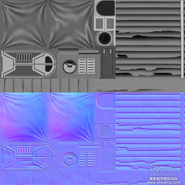
Here’s how the height map looks (Fig.22). Basically it’s a greyscale map that defines the depth of each detail. Contrast is very important as it is the element that will add depth to the resulting normal map.
下面是高度贴图的样子(Fig.22).基本上就是使用灰度来表示不同区域的深度。对比度是非常重要的,因为这是将高度转换成法线贴图的基本要素。
This is how the resulting normal map looks after using the nVidia Normal Map Filter on the previously created height map (Fig.23). You can also use Crazybump or Xnormal for the same purpose. This normal map can be further enhanced in Photoshop before being used. If some details need to be more pronounced, they can be duplicated on the normal map and the resulting layer can be set to Overlay. This will increase the depth of that area.
这是对前面的创建的高度贴图使用了nVidia Normal Map滤镜所创建的法线贴图(Fig.23).你也可使用Crazybump和Xnormal这两个软件来获得相同的结果,法线贴图在使用之前需要在Photoshop里面优化一下。如果有些区域的法线贴图需要强化,那么可以复制这个区域的法线贴图,然后把复制出来的法线贴图的混合模式改成Overlay.。这样就会增加这块区域的深度。
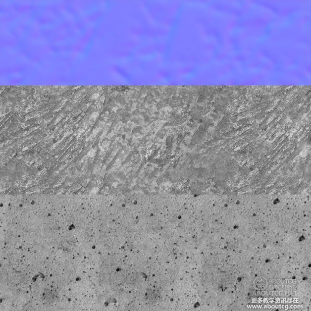
The same method has been used for the second texture. Here is the height map and the normal map for that texture in one image (Fig.24).
第二张贴图也使用了同样的方法,这里同时显示了高度贴图和法线贴图。
For some areas I have also added normal map details that were not taken from the diffuse map. Here are a few such details that have been added to the previous normal maps with Overlay to add variation to them (Fig.25).
在有些地方我添加了不是从颜色贴图获得的法线贴图细节。下面是一些作为细节添加到前面的法线贴图上的,使用Overlay的混合模式进行融合来获得很多的细节变化。(Fig.25).
Finally, the specular map! The specular map’s basic role is to dictate how much light is reflected off a surface. Materials like wood, brick or concrete will have lower specular values, while glass, metals and other metals have higher values. The same as with the normal map, the specular map requires careful examination of the surfaces involved to guarantee proper results. Some 3D engines might use a greyscale specular map, others a coloured one.
最后是高光贴图!高光贴图决定这模型的表面有多少的光会被反射。一些如木头、砖块或者混凝土光泽度很低,而玻璃,金属等的光泽度比较高,如同法线贴图一样,高光贴图需要仔细的检查模型的表面以保证正确的结果,有些游戏3D引擎会使用无色的也就是黑白灰的高光贴图,有些却可以使用有颜色的高光贴图。
In the following images, the bright areas represent the windows with some dark areas for the parts that are dirty. The metal surfaces have brighter values with dark areas for rust and brighter areas for shiny details. The darkest values are for the bricks, concrete and wood. Of course, if the wood is painted, its specular value will be higher – same goes for wet or polished bricks. Another rule would be that older surfaces tend to reflect less light than new surfaces as they are affected by dirt, dust and/or rust, all of which have very low specular values.
在下面的图片里,白色区域是窗户的位置,窗户里面的深色是污垢。金属表面的亮度值比较高,金属表面的锈迹比较暗,一些破损的细节比较亮。最黑的区域是砖块,混凝土和木头的位置。当然,如果木头内刷了油漆,其高光将会更亮些,湿的或者打磨过的砖块也一样会亮些,其他的一些规则是通常来说旧的物体表面没有新的物体表面那么光亮,只要是就的物体会受到污垢,灰尘或者锈迹的影响,而这些污垢,灰尘或者锈迹的光泽度都很低。
In general, the specular map will have more contrast than the diffuse colour it has been generated from.
通常,高光贴图的对比度会大于生成高光贴图的颜色贴图的对比度。
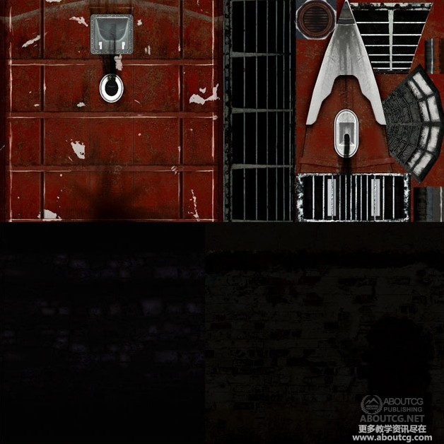
Here is how the specular maps look in this case (Fig.26 – 27).
下面是本场景中高光贴图的样子(Fig.26 – 27).
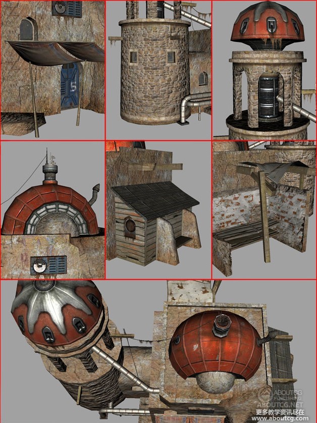
Here is a compilation of screenshots from Maya, using the High Quality Renderer (Fig.28). This is the closest you can get to the in-game image while still using Maya. Similar details can be obtained when using other software packages, too.
这是在MAYA里面编辑的截图,使用高质量渲染啊(Fig.28).这样在MAYA里面看的结果就和在游戏里看到的差不多了。在其他的3维软件里也是使用类似的方法来实现的。
Before wrapping things up, here is a list of all the 3DTotal Textures used in this tutorial:
完成这个教学之前,这里例出了在本教学用到的3DTotal Textures的纹理列表。
Parts01 Texture: ________________________________________
Total Textures V1:R2 General Textures
– paving03
Total Textures V2:R2 Aged & Stressed
– brick15
– brick18
– metal09
– paint03
– wall10
– wall13
– wall14
-wood_03
Total Textures V3:R2 Bases & Layers
– red10
Total Textures V7:R2 Sci-Fi Textures
– ceiling_01
– door_12
– hull_05
Parts02 Texture
Parts02 Texture: ________________________________________
Total Textures V2:R2 Aged & Stressed
– misc09
– paint01
– plaster06
– plaster08
– wall05
– wall18
Total Textures V3:R2 Bases & Layers
– brown_01
– normal06
Total Textures V5:R2 Dirt & Graffiti Textures
– tile02light07
– tile02medium10
– tile04heavy01
Total Textures V7:R2 Sci-Fi Textures
– window01t
Total Textures V9:R2 Ancient Tribes & Civilizations Textures
– african15
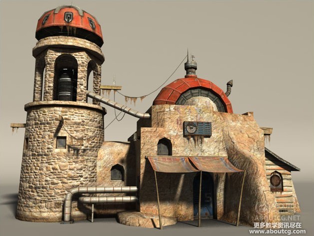
As a conclusion, I leave you with a render of the final asset (Fig.29). I hope you have enjoyed this tutorial and hopefully this will help you better understand some of the challenges of texturing for next-gen games. 最后,给大家渲染出最终的效果,(Fig.29).希望你喜欢这个教学,并且也希望这个教学能够让你更好的理解次世代游戏的纹理制作方法。
Thank you,多谢捧场。
Daniel Vijoi
Lead Texture Artist
AMC Studio

















0回复使用Total Textures创建次时代环境贴图"